Coding Practice
Assignments are designed to reinforce the code/lessons covered that week and provide you a chance to practice working with GitHub. Assignments are to be completed in your local project (on your computer) and pushed up to your GitHub repository for instructors to review by the following Wednesday. For example, homework for Week 1 (which is on September 28) should be submitted by September 28. That said, these due dates are largely suggestive as a way to help you prioritize and stay caught up as a group – if you need, or want, more time, take it. Above all, PRIORITIZE LEARNING OVER COMPLETION. We would much rather you finish half the assignment, but really understand it, than submit work that you don’t know much about. At the end of the quarter, we will simply look over the tasks you have completed in concert with the reflection you submit.
Assignments
Week 1
Because this class caters to a range of experiences, we would
like you to identify how it is you plan on earning credit for this
course. Before next week, please complete this form to select and
describe your plans.
Week 2
In Week 2’s homework we are going to practice subsetting and manipulating vectors.
First, open your r-davis-in-class-project-YourName and
pull. Remember, we always want to start working on a github
project by pulling, even if we are sure nothing has changed (believe me,
this small step will save you lots of headaches).
Second, open a new script in your r-davis-in-class-project-YourName
and save it to your scripts folder. Call this new script
week_2_homework.
Copy and paste the chunk of code below into your new
week_2_homework script and run it. This chunk of code will
create the vector you will use in your homework today. Check in your
environment to see what it looks like. What do you think each line of
code is doing?
set.seed(15)
hw2 <- runif(50, 4, 50)
hw2 <- replace(hw2, c(4,12,22,27), NA)
hw2
## [1] 31.697246 12.972021 48.457102 NA 20.885307 49.487524 41.498897
## [8] 15.682545 35.612619 42.245735 8.814791 NA 27.418158 36.504914
## [15] 43.666428 42.722117 24.582411 48.374680 10.494605 39.728776 40.971460
## [22] NA 20.447903 6.668049 30.024323 34.314318 NA 10.825658
## [29] 46.676823 25.913006 26.933701 15.810164 26.616794 9.403891 27.589087
## [36] 34.262403 9.591257 27.733004 17.877330 38.975078 46.102046 25.041810
## [43] 46.369401 15.919465 19.813791 23.741937 19.192818 38.630297 42.819312
## [50] 4.500130Take your
hw2vector and removed all the NAs then select all the numbers between 14 and 38 inclusive, call this vectorprob1.Multiply each number in the
prob1vector by 3 to create a new vector calledtimes3. Then add 10 to each number in yourtimes3vector to create a new vector calledplus10.Select every other number in your
plus10vector by selecting the first number, not the second, the third, not the fourth, etc. If you’ve worked through these three problems in order, you should now have a vector that is 12 numbers long that looks exactly like this one:
final## [1] 105.09174 57.04763 92.25447 83.74723 100.07297 87.73902 57.43049
## [8] 92.76726 93.19901 85.12543 69.44137 67.57845Finally, save your script and push all your changes to your github account.
DO NOT OPEN until you are ready to see the answers
prob1 <- hw2[!is.na(hw2)] #removing the NAs

prob1 <- prob1[prob1 >14 & prob1 < 38] #only selecting numbers between 14 and 38

times3 <- prob1 * 3 #multiplying by 3

plus10 <- times3 + 10 #adding 10 to the whole vector

final <- plus10[c(TRUE, FALSE)] #selecting every other number using logical subsetting
Week 3
Homework this week will be playing with the surveys data
we worked on in class. First things first, open your
r-davis-in-class-project and pull. Then create a new script in your
scripts folder called week_3_homework.R.
Load your survey data frame with the read.csv()
function. Create a new data frame called surveys_base with
only the species_id, the weight, and the plot_type columns. Have this
data frame only be the first 5,000 rows. Convert both species_id and
plot_type to factors. Remove all rows where there is an NA in the weight
column. Explore these variables and try to explain why a factor is
different from a character. Why might we want to use factors? Can you
think of any examples?
CHALLENGE: Create a second data frame called
challenge_base that only consists of individuals from your
surveys_base data frame with weights greater than 150g.
DO NOT OPEN until you are ready to see the answers for the the homework
#PROBLEM 1

surveys <- read.csv("data/portal_data_joined.csv") #reading the data in

colnames(surveys) #a list of the column names
## [1] "record_id" "month" "day" "year"
## [5] "plot_id" "species_id" "sex" "hindfoot_length"
## [9] "weight" "genus" "species" "taxa"
## [13] "plot_type"surveys_base <- surveys[1:5000, c(6, 9, 13)] #selecting rows 1:5000 and just columns 6, 9 and 13
surveys_base <- surveys_base[complete.cases(surveys_base), ] #selecting only the ROWS that have complete cases (no NAs) **Notice the comma was needed for this to work**
surveys_base$species_id <- factor(surveys_base$species_id) #converting factor data to character
surveys_base$plot_type <- factor(surveys_base$plot_type) #converting factor data to character
#Experimentation of factors
levels(surveys_base$species_id)## [1] "BA" "DM" "DO" "DS" "NL" "OL" "OT" "OX" "PB" "PE" "PF" "PH" "PI" "PL" "PM"
## [16] "PP" "RF" "RM" "RO" "SF" "SH" "SO"typeof(surveys_base$species_id)## [1] "integer"class(surveys_base$species_id)## [1] "factor"#CHALLENGE
challenge_base <- surveys_base[surveys_base[, 2]>150,] #selecting just the weights (column 2) that are greater than 150Week 4
By now you should be in the rhythm of pulling from your git repository and then creating new homework script. This week the homework will review data manipulation in the tidyverse.
Create a tibble named
surveysfrom the portal_data_joined.csv file.Subset
surveysusing Tidyverse methods to keep rows with weight between 30 and 60, and print out the first 6 rows.Create a new tibble showing the maximum weight for each species + sex combination and name it
biggest_critters. Sort the tibble to take a look at the biggest and smallest species + sex combinations. HINT: it’s easier to calculate max if there are no NAs in the dataframe…Try to figure out where the NA weights are concentrated in the data- is there a particular species, taxa, plot, or whatever, where there are lots of NA values? There isn’t necessarily a right or wrong answer here, but manipulate surveys a few different ways to explore this. Maybe use
tallyandarrangehere.Take
surveys, remove the rows where weight is NA and add a column that contains the average weight of each species+sex combination to the fullsurveysdataframe. Then get rid of all the columns except for species, sex, weight, and your new average weight column. Save this tibble assurveys_avg_weight.Take
surveys_avg_weightand add a new column calledabove_averagethat contains logical values stating whether or not a row’s weight is above average for its species+sex combination (recall the new column we made for this tibble).
DO NOT OPEN until you are ready to see the answers for the homework
library(tidyverse)## ── Attaching core tidyverse packages ─
## ✔ dplyr 1.1.4 ✔ readr 2.1.5
## ✔ forcats 1.0.0 ✔ stringr 1.5.1
## ✔ ggplot2 3.4.4 ✔ tibble 3.2.1
## ✔ lubridate 1.9.3 ✔ tidyr 1.3.1
## ✔ purrr 1.0.2
## ── Conflicts ─────────────────────────
## ✖ dplyr::filter() masks stats::filter()
## ✖ dplyr::lag() masks stats::lag()
## ℹ Use the conflicted package (<http://conflicted.r-lib.org/>) to force all conflicts to become errors#1
surveys <- read_csv("data/portal_data_joined.csv")## Rows: 34786 Columns: 13
## ── Column specification ──────────────
## Delimiter: ","
## chr (6): species_id, sex, genus, species, taxa, plot_type
## dbl (7): record_id, month, day, year, plot_id, hindfoot_length, weight
##
## ℹ Use `spec()` to retrieve the full column specification for this data.
## ℹ Specify the column types or set `show_col_types = FALSE` to quiet this message.#2
surveys %>%
filter(weight > 30 & weight < 60)## # A tibble: 14,730 × 13
## record_id month day year plot_id species_id sex hindfoot_length weight
## <dbl> <dbl> <dbl> <dbl> <dbl> <chr> <chr> <dbl> <dbl>
## 1 5966 5 22 1982 2 NL F 32 40
## 2 226 9 13 1977 2 DM M 37 51
## 3 233 9 13 1977 2 DM M 25 44
## 4 245 10 16 1977 2 DM M 37 39
## 5 251 10 16 1977 2 DM M 36 49
## 6 257 10 16 1977 2 DM M 37 47
## 7 259 10 16 1977 2 DM M 36 41
## 8 268 10 16 1977 2 DM F 36 55
## 9 346 11 12 1977 2 DM F 37 36
## 10 350 11 12 1977 2 DM M 37 47
## # ℹ 14,720 more rows
## # ℹ 4 more variables: genus <chr>, species <chr>, taxa <chr>, plot_type <chr>#3
biggest_critters <- surveys %>%
filter(!is.na(weight)) %>%
group_by(species_id, sex) %>%
summarise(max_weight = max(weight))## `summarise()` has grouped output by
## 'species_id'. You can override using
## the `.groups` argument.biggest_critters %>% arrange(max_weight)## # A tibble: 64 × 3
## # Groups: species_id [25]
## species_id sex max_weight
## <chr> <chr> <dbl>
## 1 PF <NA> 8
## 2 BA M 9
## 3 RO M 11
## 4 RO F 13
## 5 RF M 15
## 6 RM <NA> 16
## 7 BA F 18
## 8 PE <NA> 18
## 9 PI <NA> 18
## 10 PP <NA> 18
## # ℹ 54 more rowsbiggest_critters %>% arrange(desc(max_weight))## # A tibble: 64 × 3
## # Groups: species_id [25]
## species_id sex max_weight
## <chr> <chr> <dbl>
## 1 NL M 280
## 2 NL F 274
## 3 NL <NA> 243
## 4 SF F 199
## 5 DS F 190
## 6 DS M 170
## 7 DS <NA> 152
## 8 SH F 140
## 9 SH <NA> 130
## 10 SS M 130
## # ℹ 54 more rows#4
surveys %>%
filter(is.na(weight)) %>%
group_by(species) %>%
tally() %>%
arrange(desc(n))## # A tibble: 37 × 2
## species n
## <chr> <int>
## 1 harrisi 437
## 2 merriami 334
## 3 bilineata 303
## 4 spilosoma 246
## 5 spectabilis 160
## 6 ordii 123
## 7 albigula 100
## 8 penicillatus 99
## 9 torridus 89
## 10 baileyi 81
## # ℹ 27 more rowssurveys %>%
filter(is.na(weight)) %>%
group_by(plot_id) %>%
tally() %>%
arrange(desc(n))## # A tibble: 24 × 2
## plot_id n
## <dbl> <int>
## 1 13 160
## 2 15 155
## 3 14 152
## 4 20 152
## 5 12 144
## 6 17 144
## 7 11 119
## 8 9 118
## 9 2 117
## 10 21 106
## # ℹ 14 more rowssurveys %>%
filter(is.na(weight)) %>%
group_by(year) %>%
tally() %>%
arrange(desc(n))## # A tibble: 26 × 2
## year n
## <dbl> <int>
## 1 1977 221
## 2 1998 195
## 3 1987 151
## 4 1988 130
## 5 1978 124
## 6 1982 123
## 7 1989 123
## 8 1991 108
## 9 2002 108
## 10 1992 106
## # ℹ 16 more rows#5
surveys_avg_weight <- surveys %>%
filter(!is.na(weight)) %>%
group_by(species_id, sex) %>%
mutate(avg_weight = mean(weight)) %>%
select(species_id, sex, weight, avg_weight)
surveys_avg_weight## # A tibble: 32,283 × 4
## # Groups: species_id, sex [64]
## species_id sex weight avg_weight
## <chr> <chr> <dbl> <dbl>
## 1 NL M 218 166.
## 2 NL M 204 166.
## 3 NL M 200 166.
## 4 NL M 199 166.
## 5 NL M 197 166.
## 6 NL M 218 166.
## 7 NL M 166 166.
## 8 NL M 184 166.
## 9 NL M 206 166.
## 10 NL F 274 154.
## # ℹ 32,273 more rows#6
surveys_avg_weight <- surveys_avg_weight %>%
mutate(above_average = weight > avg_weight)
surveys_avg_weight## # A tibble: 32,283 × 5
## # Groups: species_id, sex [64]
## species_id sex weight avg_weight above_average
## <chr> <chr> <dbl> <dbl> <lgl>
## 1 NL M 218 166. TRUE
## 2 NL M 204 166. TRUE
## 3 NL M 200 166. TRUE
## 4 NL M 199 166. TRUE
## 5 NL M 197 166. TRUE
## 6 NL M 218 166. TRUE
## 7 NL M 166 166. TRUE
## 8 NL M 184 166. TRUE
## 9 NL M 206 166. TRUE
## 10 NL F 274 154. TRUE
## # ℹ 32,273 more rowsWeek 5
This week’s questions will have us practicing pivots and conditional statements.
Create a tibble named
surveysfrom the portal_data_joined.csv file. Then manipulatesurveysto create a new dataframe calledsurveys_widewith a column for genus and a column named after every plot type, with each of these columns containing the mean hindfoot length of animals in that plot type and genus. So every row has a genus and then a mean hindfoot length value for every plot type. The dataframe should be sorted by values in the Control plot type column. This question will involve quite a few of the functions you’ve used so far, and it may be useful to sketch out the steps to get to the final result.Using the original
surveysdataframe, use the two different functions we laid out for conditional statements, ifelse() and case_when(), to calculate a new weight category variable calledweight_cat. For this variable, define the rodent weight into three categories, where “small” is less than or equal to the 1st quartile of weight distribution, “medium” is between (but not inclusive) the 1st and 3rd quartile, and “large” is any weight greater than or equal to the 3rd quartile. (Hint: the summary() function on a column summarizes the distribution). For ifelse() and case_when(), compare what happens to the weight values of NA, depending on how you specify your arguments.
BONUS: How might you soft code the values (i.e. not type them in manually) of the 1st and 3rd quartile into your conditional statements in question 2?
DO NOT OPEN until you are ready to see the answers for the homework
# 1
library(tidyverse)
surveys <- read_csv("data/portal_data_joined.csv")
## Rows: 34786 Columns: 13
## ── Column specification ──────────────
## Delimiter: ","
## chr (6): species_id, sex, genus, species, taxa, plot_type
## dbl (7): record_id, month, day, year, plot_id, hindfoot_length, weight
##
## ℹ Use `spec()` to retrieve the full column specification for this data.
## ℹ Specify the column types or set `show_col_types = FALSE` to quiet this message.surveys_wide <- surveys %>%
filter(!is.na(hindfoot_length)) %>%
group_by(genus, plot_type) %>%
summarise(mean_hindfoot = mean(hindfoot_length)) %>%
pivot_wider(names_from = plot_type, values_from = mean_hindfoot) %>%
arrange(Control)## `summarise()` has grouped output by
## 'genus'. You can override using the
## `.groups` argument.# 2
summary(surveys$weight)## Min. 1st Qu. Median Mean 3rd Qu. Max. NA's
## 4.00 20.00 37.00 42.67 48.00 280.00 2503# The final "else" argument here, where I used the T ~ "large" applies even to NAs, which is not something we want
surveys %>%
mutate(weight_cat = case_when(
weight <= 20.00 ~ "small",
weight > 20.00 & weight < 48.00 ~ "medium",
T ~ "large"
))## # A tibble: 34,786 × 14
## record_id month day year plot_id species_id sex hindfoot_length weight
## <dbl> <dbl> <dbl> <dbl> <dbl> <chr> <chr> <dbl> <dbl>
## 1 1 7 16 1977 2 NL M 32 NA
## 2 72 8 19 1977 2 NL M 31 NA
## 3 224 9 13 1977 2 NL <NA> NA NA
## 4 266 10 16 1977 2 NL <NA> NA NA
## 5 349 11 12 1977 2 NL <NA> NA NA
## 6 363 11 12 1977 2 NL <NA> NA NA
## 7 435 12 10 1977 2 NL <NA> NA NA
## 8 506 1 8 1978 2 NL <NA> NA NA
## 9 588 2 18 1978 2 NL M NA 218
## 10 661 3 11 1978 2 NL <NA> NA NA
## # ℹ 34,776 more rows
## # ℹ 5 more variables: genus <chr>, species <chr>, taxa <chr>, plot_type <chr>,
## # weight_cat <chr># To overcome this, case_when() allows us to not even use an "else" argument, and just specify the final argument to reduce confusion. This leaves NAs as is
surveys %>%
mutate(weight_cat = case_when(
weight <= 20.00 ~ "small",
weight > 20.00 & weight < 48.00 ~ "medium",
weight >= 48.00 ~ "large"
))## # A tibble: 34,786 × 14
## record_id month day year plot_id species_id sex hindfoot_length weight
## <dbl> <dbl> <dbl> <dbl> <dbl> <chr> <chr> <dbl> <dbl>
## 1 1 7 16 1977 2 NL M 32 NA
## 2 72 8 19 1977 2 NL M 31 NA
## 3 224 9 13 1977 2 NL <NA> NA NA
## 4 266 10 16 1977 2 NL <NA> NA NA
## 5 349 11 12 1977 2 NL <NA> NA NA
## 6 363 11 12 1977 2 NL <NA> NA NA
## 7 435 12 10 1977 2 NL <NA> NA NA
## 8 506 1 8 1978 2 NL <NA> NA NA
## 9 588 2 18 1978 2 NL M NA 218
## 10 661 3 11 1978 2 NL <NA> NA NA
## # ℹ 34,776 more rows
## # ℹ 5 more variables: genus <chr>, species <chr>, taxa <chr>, plot_type <chr>,
## # weight_cat <chr># The "else" argument in ifelse() does not include NAs when specified, which is useful. The shortcoming, however, is that ifelse() does not allow you to leave out a final else argument, which means it is really important to always check the work on what that last argument assigns to.
surveys %>%
mutate(weight_cat = ifelse(weight <= 20.00, "small",
ifelse(weight > 20.00 & weight < 48.00, "medium","large")))## # A tibble: 34,786 × 14
## record_id month day year plot_id species_id sex hindfoot_length weight
## <dbl> <dbl> <dbl> <dbl> <dbl> <chr> <chr> <dbl> <dbl>
## 1 1 7 16 1977 2 NL M 32 NA
## 2 72 8 19 1977 2 NL M 31 NA
## 3 224 9 13 1977 2 NL <NA> NA NA
## 4 266 10 16 1977 2 NL <NA> NA NA
## 5 349 11 12 1977 2 NL <NA> NA NA
## 6 363 11 12 1977 2 NL <NA> NA NA
## 7 435 12 10 1977 2 NL <NA> NA NA
## 8 506 1 8 1978 2 NL <NA> NA NA
## 9 588 2 18 1978 2 NL M NA 218
## 10 661 3 11 1978 2 NL <NA> NA NA
## # ℹ 34,776 more rows
## # ℹ 5 more variables: genus <chr>, species <chr>, taxa <chr>, plot_type <chr>,
## # weight_cat <chr># BONUS:
summ <- summary(surveys$weight)
# Remember our indexing skills from the first weeks? Play around with single and double bracketing to see how it can extract values
summ[[2]]## [1] 20summ[[5]]## [1] 48# Then you can next these into your code
surveys %>%
mutate(weight_cat = case_when(
weight >= summ[[2]] ~ "small",
weight > summ[[2]] & weight < summ[[5]] ~ "medium",
weight >= summ[[5]] ~ "large"
))## # A tibble: 34,786 × 14
## record_id month day year plot_id species_id sex hindfoot_length weight
## <dbl> <dbl> <dbl> <dbl> <dbl> <chr> <chr> <dbl> <dbl>
## 1 1 7 16 1977 2 NL M 32 NA
## 2 72 8 19 1977 2 NL M 31 NA
## 3 224 9 13 1977 2 NL <NA> NA NA
## 4 266 10 16 1977 2 NL <NA> NA NA
## 5 349 11 12 1977 2 NL <NA> NA NA
## 6 363 11 12 1977 2 NL <NA> NA NA
## 7 435 12 10 1977 2 NL <NA> NA NA
## 8 506 1 8 1978 2 NL <NA> NA NA
## 9 588 2 18 1978 2 NL M NA 218
## 10 661 3 11 1978 2 NL <NA> NA NA
## # ℹ 34,776 more rows
## # ℹ 5 more variables: genus <chr>, species <chr>, taxa <chr>, plot_type <chr>,
## # weight_cat <chr>Week 6
For our week six homework, we are going to be practicing the skills
we learned with ggplot during class. You will be happy to know that we
are going to be using a brand new data set called
gapminder. This data set is looking at statistics for a few
different counties including population, GDP per capita, and life
expectancy. Download the data using the code below. Remember, this code
is looking for a folder called data to put the .csv in, so
make sure you have a folder named data, or modify the code
to the correct folder name.
library(tidyverse)

gapminder <- read_csv("https://ucd-cepb.github.io/R-DAVIS/data/gapminder.csv") #ONLY change the "data" part of this path if necessary
## Rows: 1704 Columns: 6
## ── Column specification ──────────────
## Delimiter: ","
## chr (2): country, continent
## dbl (4): year, pop, lifeExp, gdpPercap
##
## ℹ Use `spec()` to retrieve the full column specification for this data.
## ℹ Specify the column types or set `show_col_types = FALSE` to quiet this message.First calculates mean life expectancy on each continent. Then create a plot that shows how life expectancy has changed over time in each continent. Try to do this all in one step using pipes! (aka, try not to create intermediate dataframes)
Look at the following code and answer the following questions. What do you think the
scale_x_log10()line of code is achieving? What about thegeom_smooth()line of code?
Challenge! Modify the above code to size the points in proportion to the population of the country. Hint: Are you translating data to a visual feature of the plot?
Hint: There’s no cost to tinkering! Try some code out and see what happens with or without particular elements.
ggplot(gapminder, aes(x = gdpPercap, y = lifeExp)) +
    geom_point(aes(color = continent), size = .25) +
    scale_x_log10() +
    geom_smooth(method = 'lm', color = 'black', linetype = 'dashed') +
    theme_bw()
## `geom_smooth()` using formula = 'y ~
## x'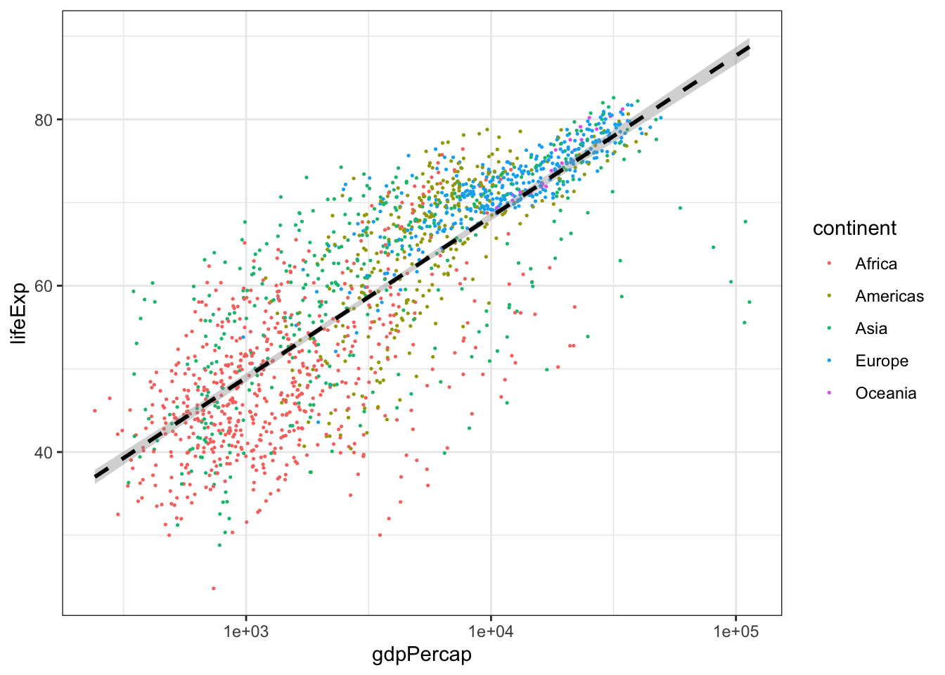
- Create a boxplot that shows the life expectency for Brazil, China, El Salvador, Niger, and the United States, with the data points in the backgroud using geom_jitter. Label the X and Y axis with “Country” and “Life Expectancy” and title the plot “Life Expectancy of Five Countries”.
DO NOT OPEN until you are ready to see the answers!
library(tidyverse)

#PROBLEM 1:

gapminder %>%
  group_by(continent, year) %>%
  summarize(mean_lifeExp = mean(lifeExp)) %>% #calculating the mean life expectancy for each continent and year
  ggplot()+
  geom_point(aes(x = year, y = mean_lifeExp, color = continent))+ #scatter plot
  geom_line(aes(x = year, y = mean_lifeExp, color = continent)) #line plot
## `summarise()` has grouped output by
## 'continent'. You can override using
## the `.groups` argument.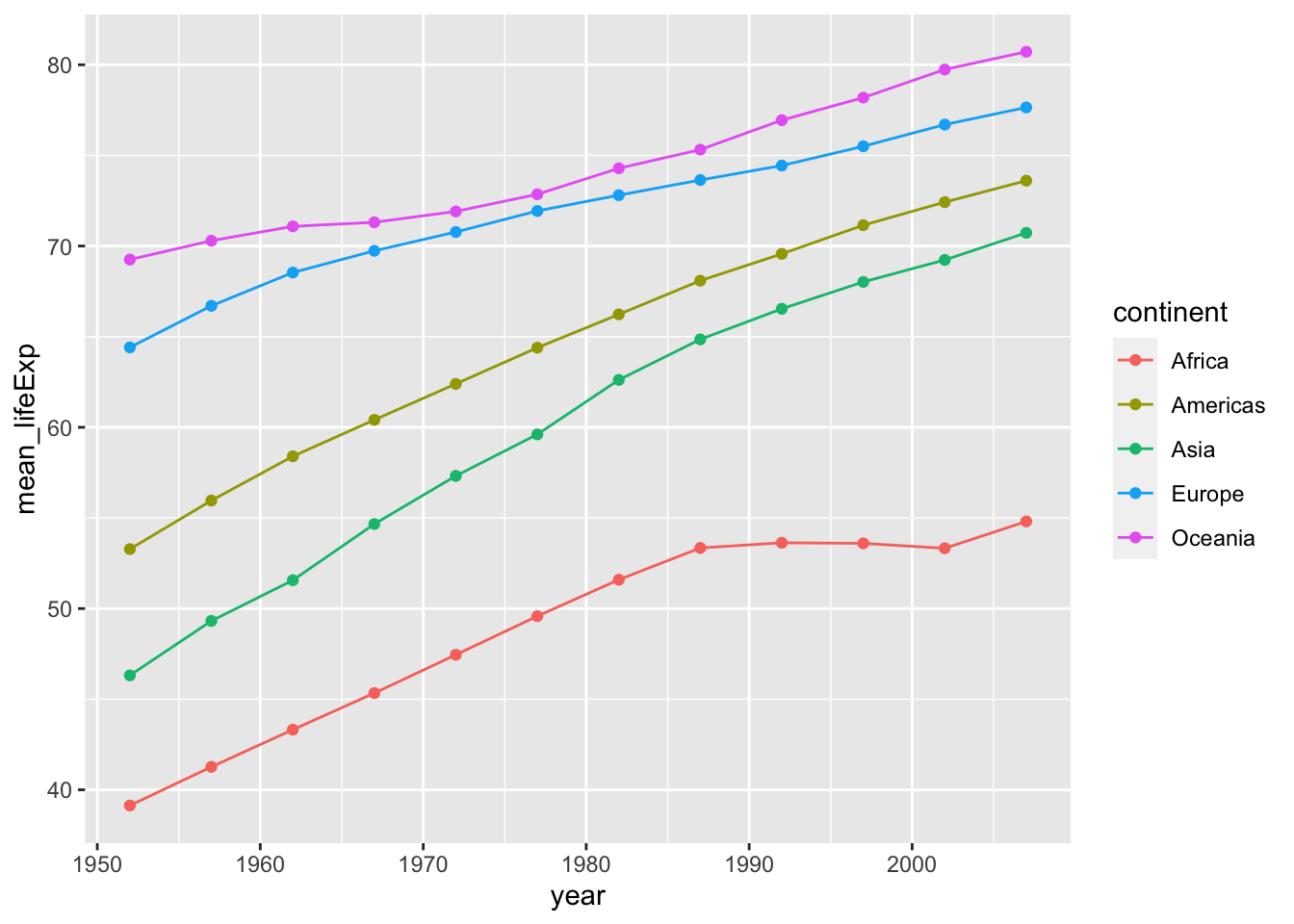
#there are other ways to represent this data and answer this question. Try a facet wrap! Play around with themes and ggplotly!


#PROBLEM 2:

#challenge answer
ggplot(gapminder, aes(x = gdpPercap, y = lifeExp)) +
    geom_point(aes(color = continent, size = pop)) +
    scale_x_log10() +
    geom_smooth(method = 'lm', color = 'black', linetype = 'dashed') +
    theme_bw()
## `geom_smooth()` using formula = 'y ~
## x'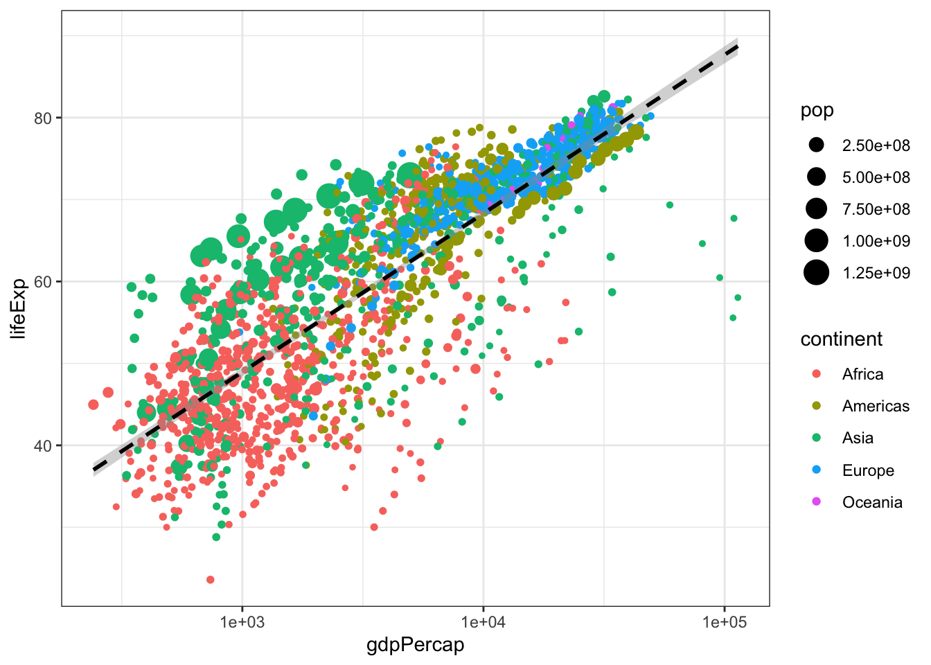
#PROBLEM 3:

countries <- c("Brazil", "China", "El Salvador", "Niger", "United States") #create a vector with just the countries we are interested in

gapminder %>%
  filter(country %in% countries) %>%
  ggplot(aes(x = country, y = lifeExp))+
  geom_boxplot() +
  geom_jitter(alpha = 0.3, color = "blue")+
  theme_minimal() +
  ggtitle("Life Expectancy of Five Countries") + #title the figure
  theme(plot.title = element_text(hjust = 0.5)) + #centered the plot title
  xlab("Country") + ylab("Life Expectancy") #how to change axis names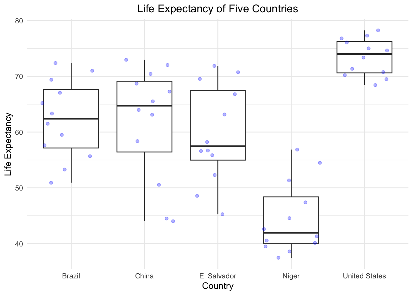
Week 7
For week 7, we’re going to be working on 2 critical
ggplot skills: recreating a graph from a dataset and
googling stuff.
Our goal will be to make this final graph using the
gapminder dataset:
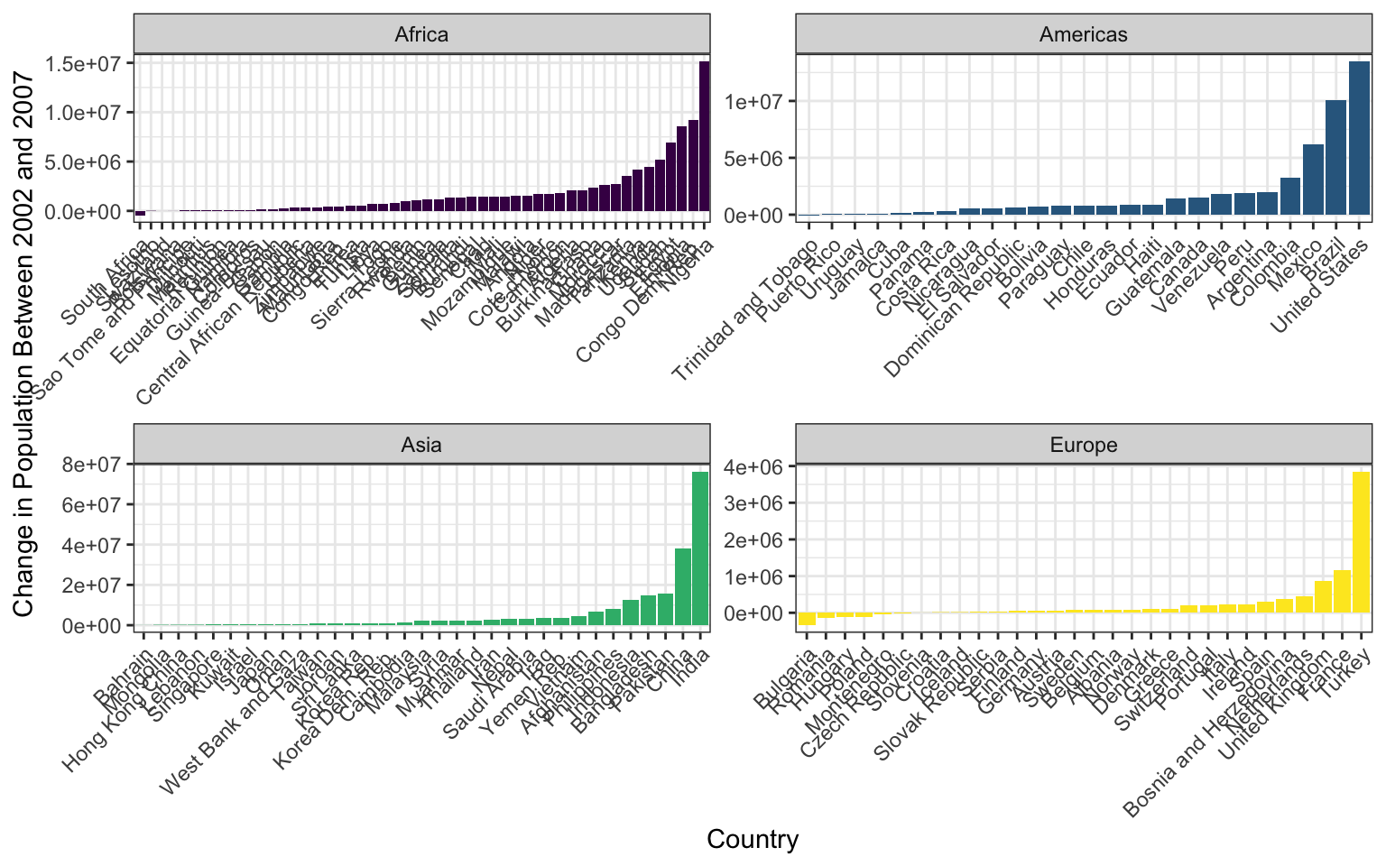
The x axis labels are all scrunched up because we can’t make the image bigger on the webpage, but if you make it and then zoom it bigger in RStudio it looks much better.
We’ll touch on some intermediate steps here, since it might take quite a few steps to get from start to finish. Here are some things to note:
To get the population difference between 2002 and 2007 for each country, it would probably be easiest to have a country in each row and a column for 2002 population and a column for 2007 population.
Notice the order of countries within each facet. You’ll have to look up how to order them in this way.
Also look at how the axes are different for each facet. Try looking through
?facet_wrapto see if you can figure this one out.The color scale is different from the default- feel free to try out other color scales, just don’t use the defaults!
The theme here is different from the default in a few ways, again, feel free to play around with other non-default themes.
The axis labels are rotated! Here’s a hint:
angle = 45, hjust = 1. It’s up to you (and Google) to figure out where this code goes!Is there a legend on this plot?
This lesson should illustrate a key reality of making plots in R, one
that applies as much to experts as beginners: 10% of your effort gets
the plot 90% right, and 90% of the effort is getting the plot perfect.
ggplot is incredibly powerful for exploratory analysis, as
you can get a good plot with only a few lines of code. It’s also
extremely flexible, allowing you to tweak nearly everything about a plot
to get a highly polished final product, but these little tweaks can take
a lot of time to figure out!
So if you spend most of your time on this lesson googling stuff, you’re not alone!
DO NOT OPEN until you are ready to see the answers
library(tidyverse)

gapminder <- read_csv("data/gapminder.csv")

pg <- gapminder %>%
  select(country, year, pop, continent) %>%
  filter(year > 2000) %>%
  pivot_wider(names_from = year, values_from = pop) %>%
  mutate(pop_change_0207 = `2007` - `2002`)

pg %>%
  filter(continent != "Oceania") %>%
  ggplot(aes(x = reorder(country, pop_change_0207), y = pop_change_0207)) +
  geom_col(aes(fill = continent)) +
  facet_wrap(~continent, scales = "free") +
  theme_bw() +
  scale_fill_viridis_d() +
  theme(axis.text.x = element_text(angle = 45, hjust = 1),
        legend.position = "none") +
  xlab("Country") +
  ylab("Change in Population Between 2002 and 2007")
Week 8
Let’s look at some real data from Mauna Loa to try to format and
plot. These meteorological data from Mauna Loa were collected every
minute for the year 2001. This dataset has 459,769 observations for
9 different metrics of wind, humidity, barometric pressure, air
temperature, and precipitation. Download this dataset here. Save it to your
data/ folder. Alternatively, you can read the CSV directly
from the R-DAVIS Github:
mloa <- read_csv("https://raw.githubusercontent.com/ucd-cepb/R-DAVIS/master/data/mauna_loa_met_2001_minute.csv")
Use the README file
associated with the Mauna Loa dataset to determine in what time zone the
data are reported, and how missing values are reported in each column.
With the mloa data.frame, remove observations with missing
values in rel_humid, temp_C_2m, and windSpeed_m_s. Generate a column
called “datetime” using the year, month, day, hour24, and min columns.
Next, create a column called “datetimeLocal” that converts the datetime
column to Pacific/Honolulu time (HINT: look at the lubridate
function called with_tz()). Then, use dplyr to calculate
the mean hourly temperature each month using the temp_C_2m column and
the datetimeLocal columns. (HINT: Look at the lubridate
functions called month() and hour()). Finally,
make a ggplot scatterplot of the mean monthly temperature, with points
colored by local hour.
DO NOT OPEN until you are ready to see the answers
library(tidyverse)
library(lubridate)
## Data import
mloa <- read_csv("https://raw.githubusercontent.com/ucd-cepb/R-DAVIS/master/data/mauna_loa_met_2001_minute.csv")

mloa2 = mloa %>%
  # Remove NA's
  filter(rel_humid != -99) %>%
  filter(temp_C_2m != -999.9) %>%
  filter(windSpeed_m_s != -999.9) %>%
  # Create datetime column (README indicates time is in UTC)
  mutate(datetime = ymd_hm(paste0(year,"-",
                                  month, "-",
                                  day," ",
                                  hour24, ":",
                                  min),
                           tz = "UTC")) %>%
  # Convert to local time
  mutate(datetimeLocal = with_tz(datetime, tz = "Pacific/Honolulu"))

## Aggregate and plot
mloa2 %>%
  # Extract month and hour from local time column
  mutate(localMon = month(datetimeLocal, label = TRUE),
         localHour = hour(datetimeLocal)) %>%
  # Group by local month and hour
  group_by(localMon, localHour) %>%
  # Calculate mean temperature
  summarize(meantemp = mean(temp_C_2m)) %>%
  # Plot
  ggplot(aes(x = localMon,
             y = meantemp)) +
  # Color points by local hour
  geom_point(aes(col = localHour)) +
  # Use a nice color ramp
  scale_color_viridis_c() +
  # Label axes, add a theme
  xlab("Month") +
  ylab("Mean temperature (degrees C)") +
  theme_classic()
Week 9
In this assignment, you’ll use the iteration skills we built in the course to apply functions to an entire dataset.
Let’s load the surveys dataset:
surveys <- read.csv("data/portal_data_joined.csv")- Using a for loop, print to the console the longest species name of each taxon. Hint: the function nchar() gets you the number of characters in a string.
Next let’s load the Mauna Loa dataset from last week.
mloa <- read_csv("https://raw.githubusercontent.com/ucd-cepb/R-DAVIS/master/data/mauna_loa_met_2001_minute.csv")## Rows: 459769 Columns: 16
## ── Column specification ──────────────
## Delimiter: ","
## chr (2): filename, siteID
## dbl (14): year, month, day, hour24, min, windDir, windSpeed_m_s, windSteady,...
##
## ℹ Use `spec()` to retrieve the full column specification for this data.
## ℹ Specify the column types or set `show_col_types = FALSE` to quiet this message.Use the map function from purrr to print the max of each of the following columns: “windDir”,“windSpeed_m_s”,“baro_hPa”,“temp_C_2m”,“temp_C_10m”,“temp_C_towertop”,“rel_humid”,and “precip_intens_mm_hr”.
Make a function called C_to_F that converts Celsius to Fahrenheit. Hint: first you need to multiply the Celsius temperature by 1.8, then add 32. Make three new columns called “temp_F_2m”, “temp_F_10m”, and “temp_F_towertop” by applying this function to columns “temp_C_2m”, “temp_C_10m”, and “temp_C_towertop”. Bonus: can you do this by using map_df? Don’t forget to name your new columns “temp_F…” and not “temp_C…”!
DO NOT OPEN until you are ready to see the answers
#part 1
for(i in unique(surveys$taxa)){
  mytaxon <- surveys[surveys$taxa == i,]
  longestnames <- mytaxon[nchar(mytaxon$species) == max(nchar(mytaxon$species)),] %>% select(species)
  print(paste0("The longest species name(s) among ", i, "s is/are: "))
  print(unique(longestnames$species))
}

#part 2
mycols <- mloa %>% select("windDir","windSpeed_m_s","baro_hPa","temp_C_2m","temp_C_10m","temp_C_towertop","rel_humid", "precip_intens_mm_hr")
mycols %>% map(max, na.rm = T)

#part 3
C_to_F <- function(x){
  x * 1.8 + 32
}

mloa$temp_F_2m <- C_to_F(mloa$temp_C_2m)
mloa$temp_F_10m <- C_to_F(mloa$temp_C_10m)
mloa$temp_F_towertop <- C_to_F(mloa$temp_C_towertop)

#Bonus:
mloa %>% select(c("temp_C_2m", "temp_C_10m", "temp_C_towertop")) %>% map_df(C_to_F) %>% rename("temp_F_2m"="temp_C_2m", "temp_F_10m"="temp_C_10m", "temp_F_towertop"="temp_C_towertop") %>% cbind(mloa)

#challenge
surveys$genusspecies <- lapply(1:length(surveys$species), function(i){
  paste0(surveys$genus[i], " ", surveys$species[i])
})
Final assignment
Alright folks, it’s time for the final assignment of the quarter. The
goal here is to generate an script that combines the skills we’ve
learned throughout the quarter to produce several outputs.
The Data
For this project you are going to be using some data sets about flights departing New York City in 2013. There are several CSV files you will need to use (as with any CSVs you’re handed, they are likely imperfect and incomplete). You should download the flights, planes, and weather CSV files. (Remember to put them into your data folder of your RProject to make reading them in easier!)
Hint: You may have to combine dataframes to answer some questions.
Remember our join family of functions? You should be able
to use the join type we covered in class. The
flights dataset is the biggest one, so you should probably
join the other data onto this one, meaning flights would be
the first (of “left”) argument in the left join. You can’t join 3 tables
together at once, but you can join tables a and
b to make table ab, then join ab
and c to get table abc which contains the
columns from all 3 original tables.
Things to Include
- Plot the departure delay of flights against the precipitation, and
include a simple regression line as part of the plot. Hint: there is a
geom_that will plot a simpley ~ xregression line for you, but you might have to use an argument to make sure it’s a regular linear model. Useggsaveto save your ggplot objects into a new folder you create called “plots”. - Create a figure that has date on the x axis and each day’s mean departure delay on the y axis. Plot only months September through December. Somehow distinguish between airline carriers (the method is up to you). Again, save your final product into the “plot” folder.
- Create a dataframe with these columns: date (year, month and day),
mean_temp, where each row represents the airport, based on airport code.
Save this is a new csv into you
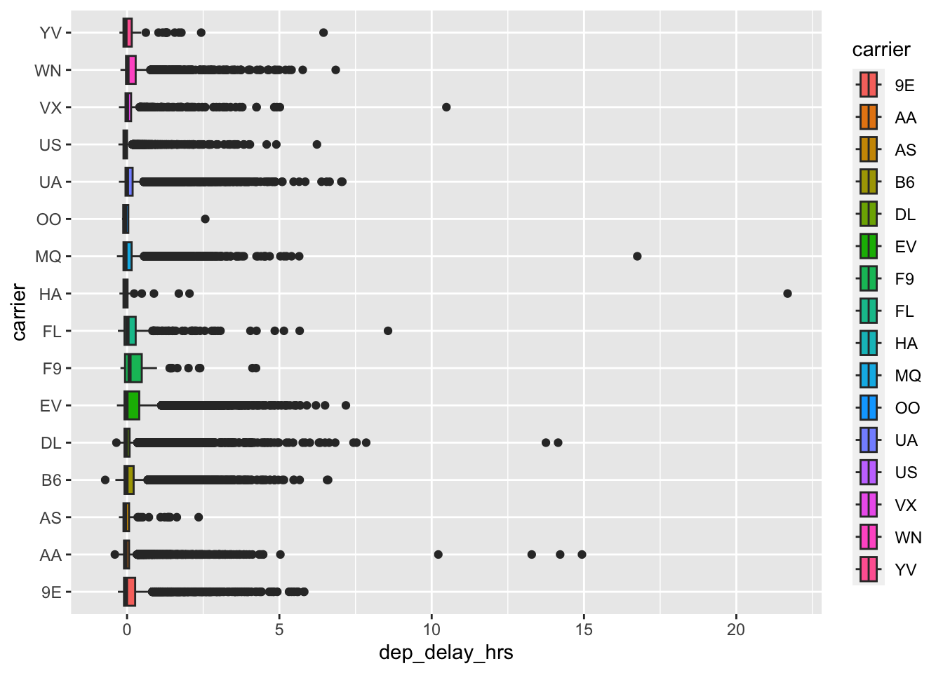
datafolder calledmean_temp_by_origin.csv. - Make a function that can: (1) convert hours to minutes; and (2) convert minutes to hours (i.e., it’s going to require some sort of conditional setting in the function that determines which direction the conversion is going). Use this function to convert departure delay (currently in minutes) to hours and then generate a boxplot of departure delay times by carrier. Save this function into a script called “customFunctions.R” in your scripts/code folder.
- Below is the plot we generated from the new data in Q4. (Base code:
ggplot(df, aes(x = dep_delay_hrs, y = carrier, fill = carrier)) + geom_boxplot()). The goal is to visualize delays by carrier. Do (at least) 5 things to improve this plot by changing, adding, or subtracting to this plot. The sky’s the limit here, remember we often reduce data to more succinctly communicate things.
## Warning: Removed 1228 rows containing
## non-finite values (`stat_boxplot()`).